For those of you who make use of the incredibly useful online information and services provided by the UK Research Office, you may like to know that they have (finally) revamped and improved their website, or rather the “UKRO Portal” as they call it:
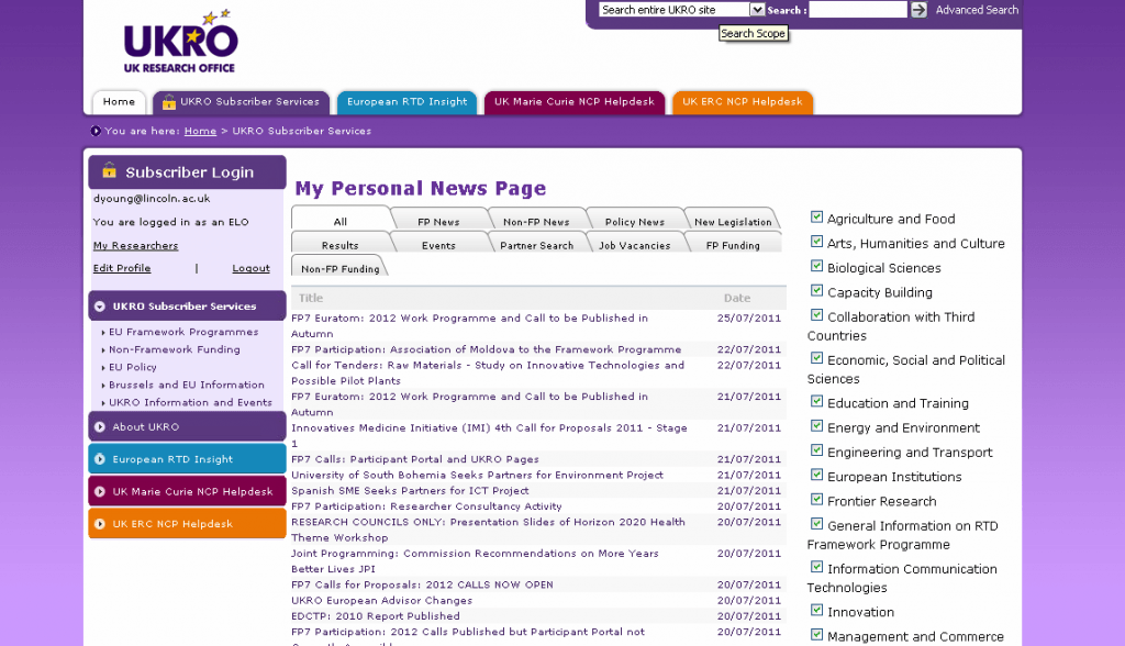
It now looks like this when you log in:
I’ve used it for a few minutes and I can already see major improvements. Here are some of my initial impressions.
As you can see, it’s a lot more purple, but there’s a lot more to it than that. It has a much cleaner interface and thanks to its liberal use of tabs it’s far easier to find the information you need fast. For example, you can click on Events to browse future and recent training and development activities, or FP News to focus on just items relating to FP7 and the future framework programme.
You also now have easy access to areas of interest on the right hand side, so you can simply tick a box to focus on results for, say, Biological Sciences, if that’s what is of interest to you.
The search function has also been much improved: it now takes just milliseconds to run a search, as opposed to over a minute on the old set up.
In summary, the new UKRO Portal provides the same high quality intelligence and information on EU funding opportunities, but the much-needed updates mean the website is now extremely useful and useable, helping you find the information you need quickly rather than being an annoying hindrance.

